We’re losing perspective on 3D CSS
August 27, 2013 § 1 Comment
Over the last few months we’ve seen quite a few interesting demos in 3D CSS. Some offer really nice UI interactions, others are built just to show us the capabilities of modern browsers blow our minds.
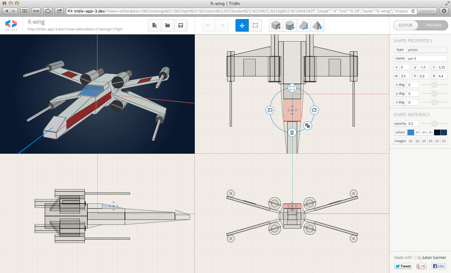
Since last week another exmple could be added to this list; Tridiv. Julian Garnier built this 3D CSS editor that has tons of features, and it’s looking really really good!

My initial reaction when I first saw Tridiv was one of pure amazement. But I also started to wonder; with these extreme examples, are we taking it too far? How far should we push this 3D CSS thing?
Christian Heilmann said this about Tridiv on : ‘… webkit only, deep in the “can do, but should you” camp’. I don’t think it’s the browser support that makes it a “can do, but should you” though. We have to remember that there are a lot of constraints when it comes to creating 3D objects with CSS. The main one being; you can only work with flat shapes. Spherical objects are impossible to create in CSS. Ok, you can use CSS custom filters, but even then, is the DOM really the foundation you want to build your 3D world on?
I’d like to echo what Guillaume Lecollinet wrote in his about using WebGL to add effects to your website:
“Don’t get me wrong, CSS 3D transforms are a wonderful tool which I definitely recommend using for basic UI effects. But as soon as you want to work with complex 3D scenes, I’d recommend going for WebGL, which gives you models, textures, lighting/shadows, and shaders to work with.”
With a demo Guillaume showed how you can integrate WebGL in the CSS layout of your website. Another great example of this is Steven Witten’s new website. Steven is using a combination of WebGL for the complex 3D shapes, and 3D CSS to place the other DOM elements in the same perspective as the 3D scene from his ‘WebGL component’.
I really think this is the way forward. We should stop creating 3D shapes in CSS, and instead put our effort in learning the real deal with tools like Three.js. And use 3D CSS only where appropriate…
Hackers gonna hack. That’s one way to look at it at least. But yes when it’s an entire tool that’s built and a set of instructions encouraging others, make me want to hold up a detour sign too. I feel like 2D CSS drawings are a waste of time. Better to make SVG / Canvas support better and better than bother with hacking around the limited CSS tools.
On the other hand, it’s almost certain that this kind of hacking will produce very useful things. And that’s a constant need.